Aetos Móveis Planejados
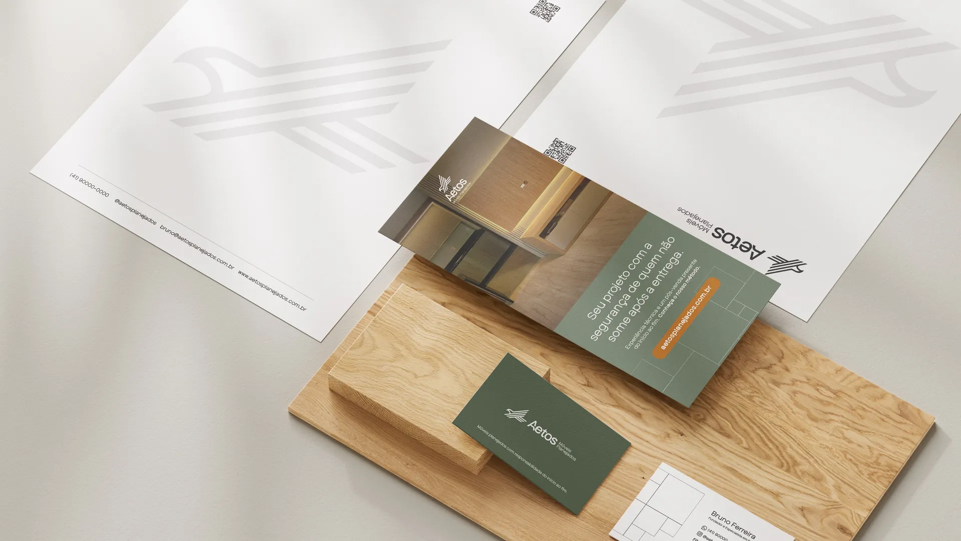
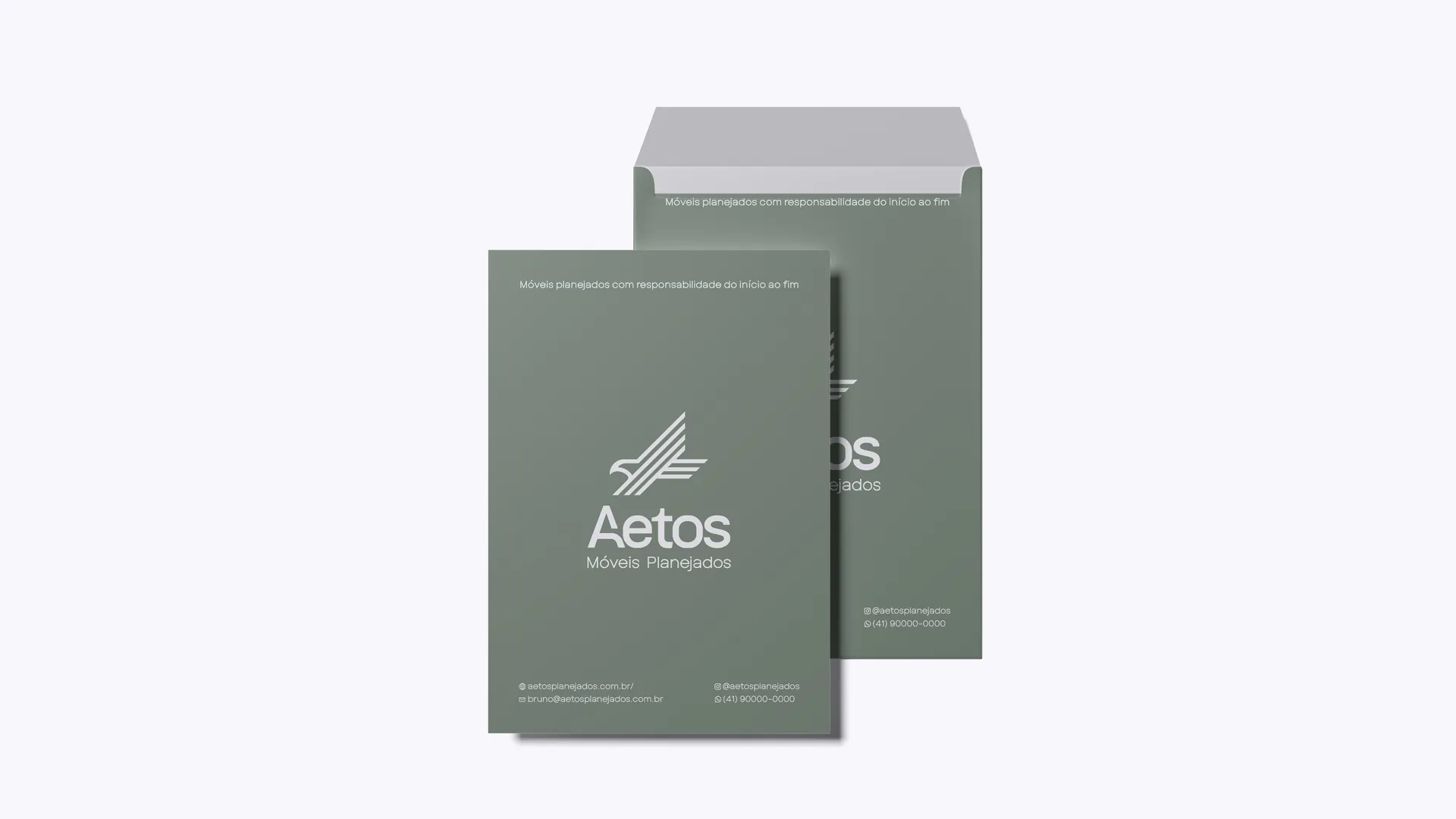
A sober, precise and welcoming brand, as well planned as the furniture itself.
About the brand
Aetos Móveis Planejados was born from the union of two things rarely found in the same place: 20 years of technical experience in the custom furniture market, including high-end projects, and a real commitment to the client after the contract is signed. More than designing and installing spaces, the company takes responsibility for the final result, from first contact to after-sales.
The brand speaks to families renovating or furnishing houses, apartments and specific spaces such as kitchens, walk-in closets and home offices. It's an audience that values clarity, on-time delivery and someone they can trust, and that has often lived through (or knows someone who has) a bad experience with joinery. Already looking toward the upper-middle and high-end market, Aetos needed to be born secure, correct and consistent: neither popular nor ostentatious.
The creative process
The challenge was to solve the industry's biggest pain point: the client's insecurity after closing the deal. While many disappear after delivery, Aetos stays. We anchored the brand in two archetypes: the Guardian at the front, protecting the client from delays, frustration and empty promises, supported by the Expert, who translates the authority built in practice by Bruno, Aetos's founder, over two decades of craft.
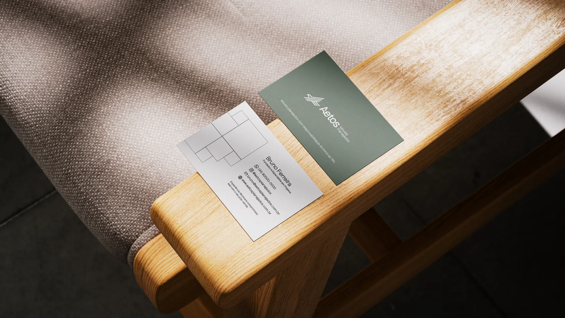
From this combination came a clear, human verbal identity, free of promotional language, that guides instead of trying to persuade, summed up in the tagline: “Custom furniture with responsibility from start to finish.” Visually, we sought the same balance: a sober, precise and welcoming brand, as well planned as the furniture itself.
“Custom furniture with responsibility from start to finish.”
The logo: the veneers and the eagle
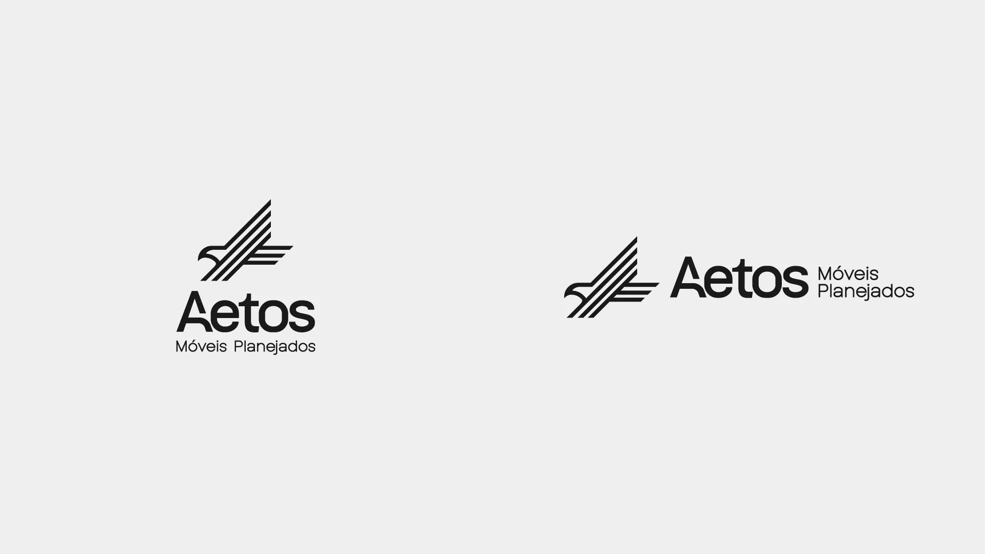
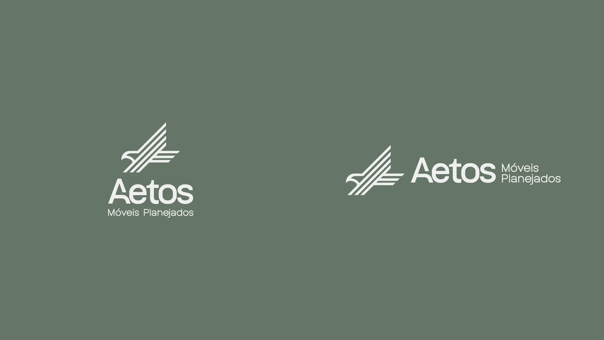
Aetos means “eagle” in Greek, and the symbol starts from exactly that idea. Parallel lines represent stacked wood veneers, the foundation of joinery work. As they cross over a precise geometric grid, these veneers form the silhouette of an eagle in flight, representing focus, vision and maturity. It's the synthesis of technical craft and strategic vision.
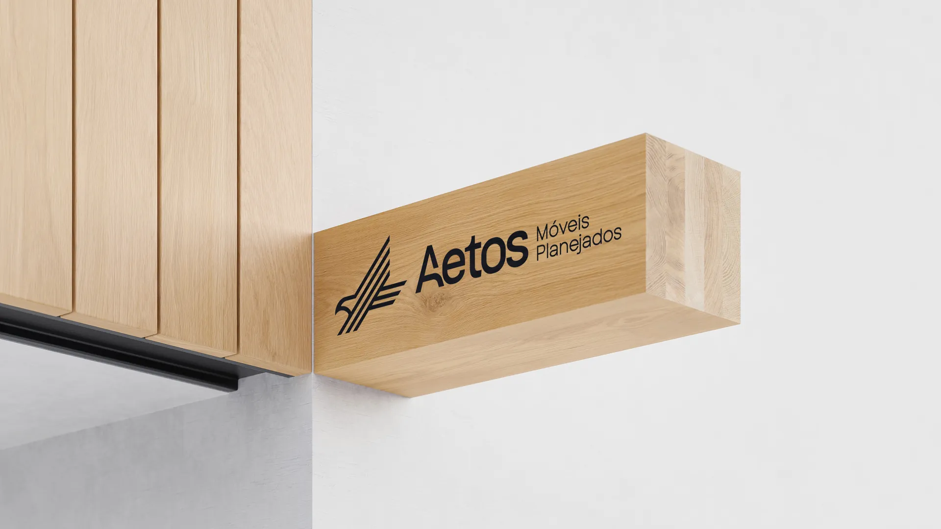
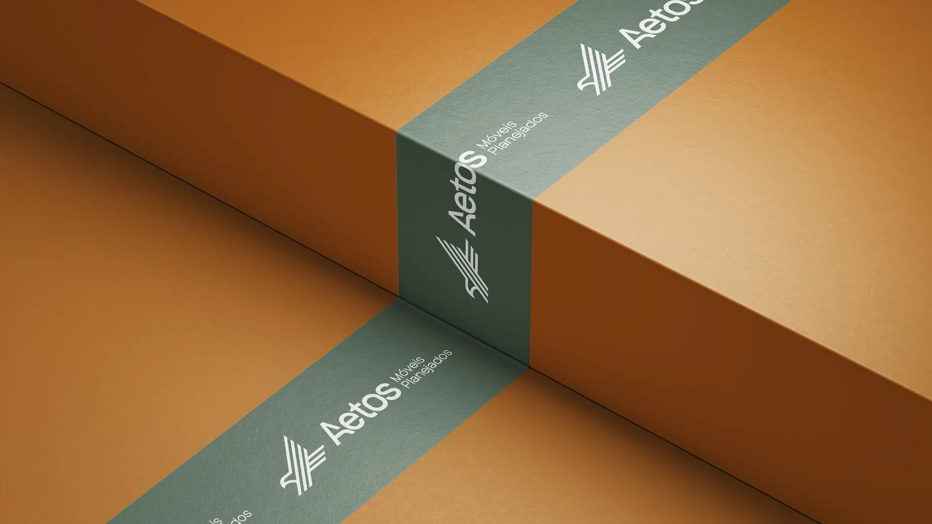
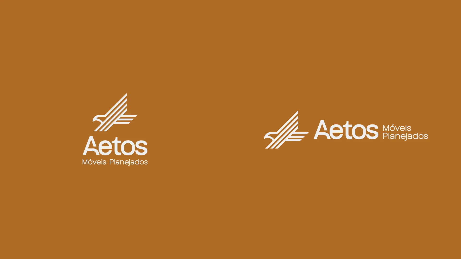
The logo was developed in two versions: the vertical one, used as the main signature in centered layouts, and the horizontal one, designed for narrower spaces such as website headers and finishing labels.



The visual system
Every element was designed to communicate what Aetos delivers: security, method and finish.
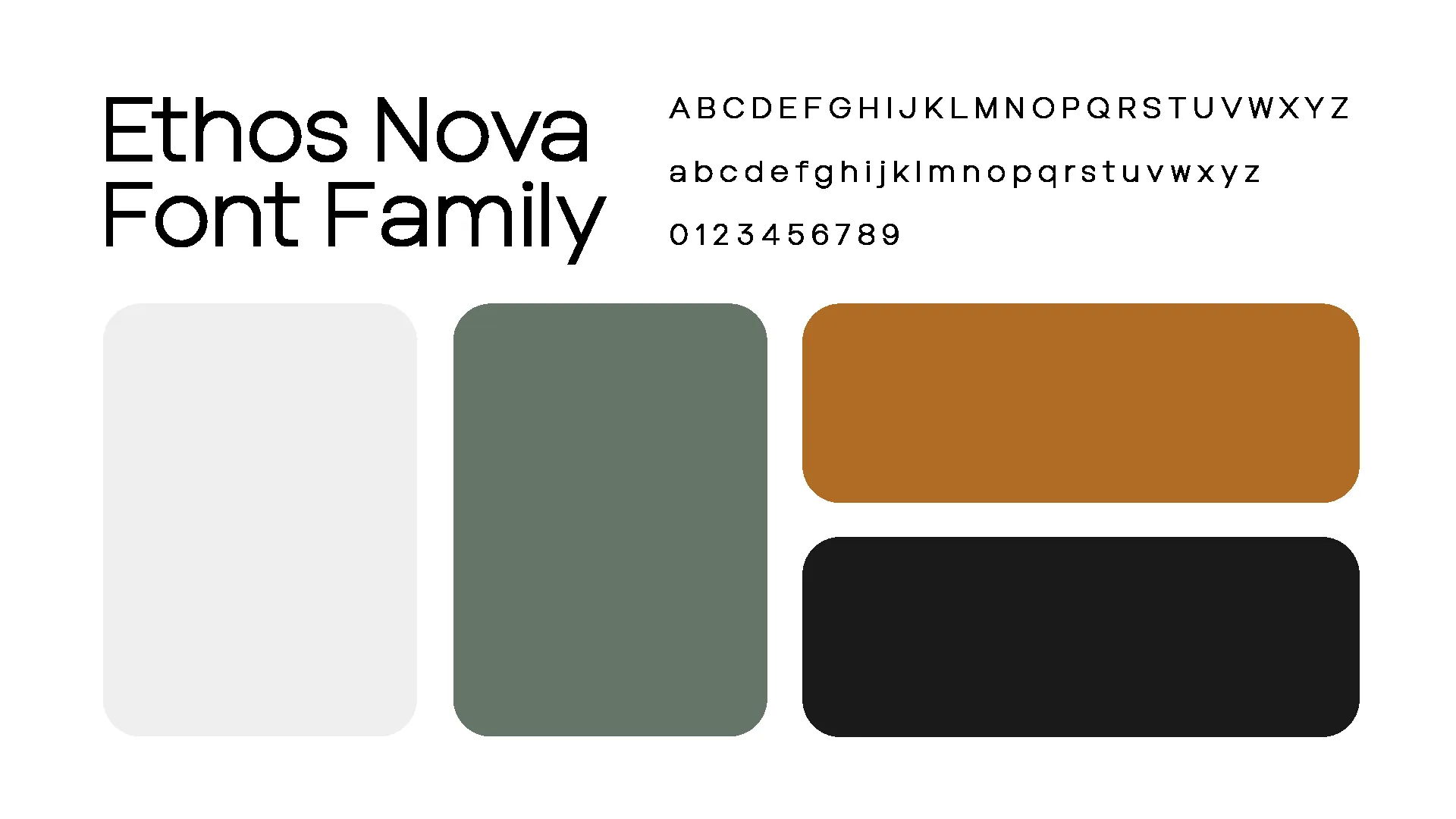
Moss Green is the brand's main color, conveying stability, nature and trust; Burnt Yellow brings the warmth of wood and the human side of service; Charcoal adds weight, sobriety and professionalism; and Off-White gives breathing room and elegance to every piece.
Ethos Nova, a modern geometric family that communicates transparency and consistency. The heavier weights give presence to headlines, while the Regular handles informational texts and contracts, with clear, direct reading.
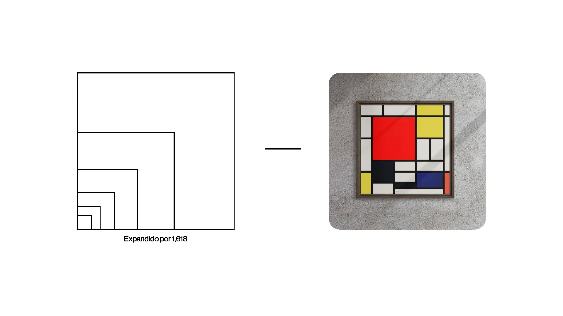
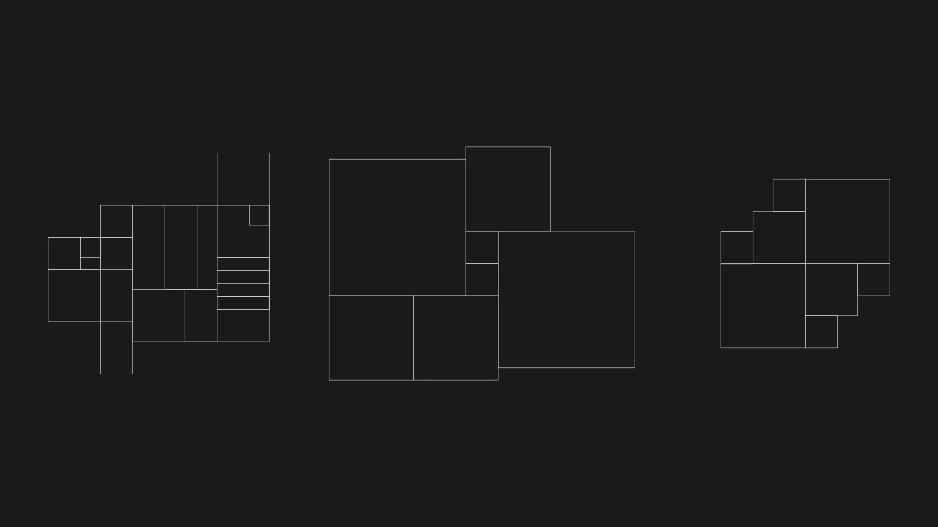
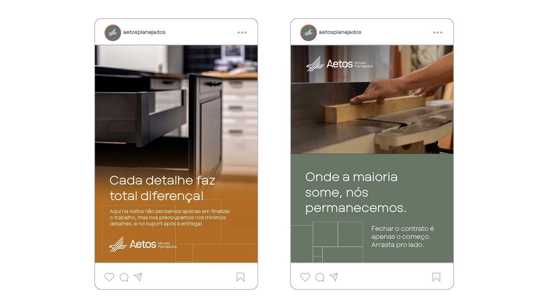
The brand's visual pattern is structured by the Golden Ratio (1.618) and inspired by Mondrian's compositions. Each block symbolizes the modular organization and technical precision of made-to-measure furniture. Used as a background texture, the grid subtly reinforces that at Aetos, nothing happens by chance.
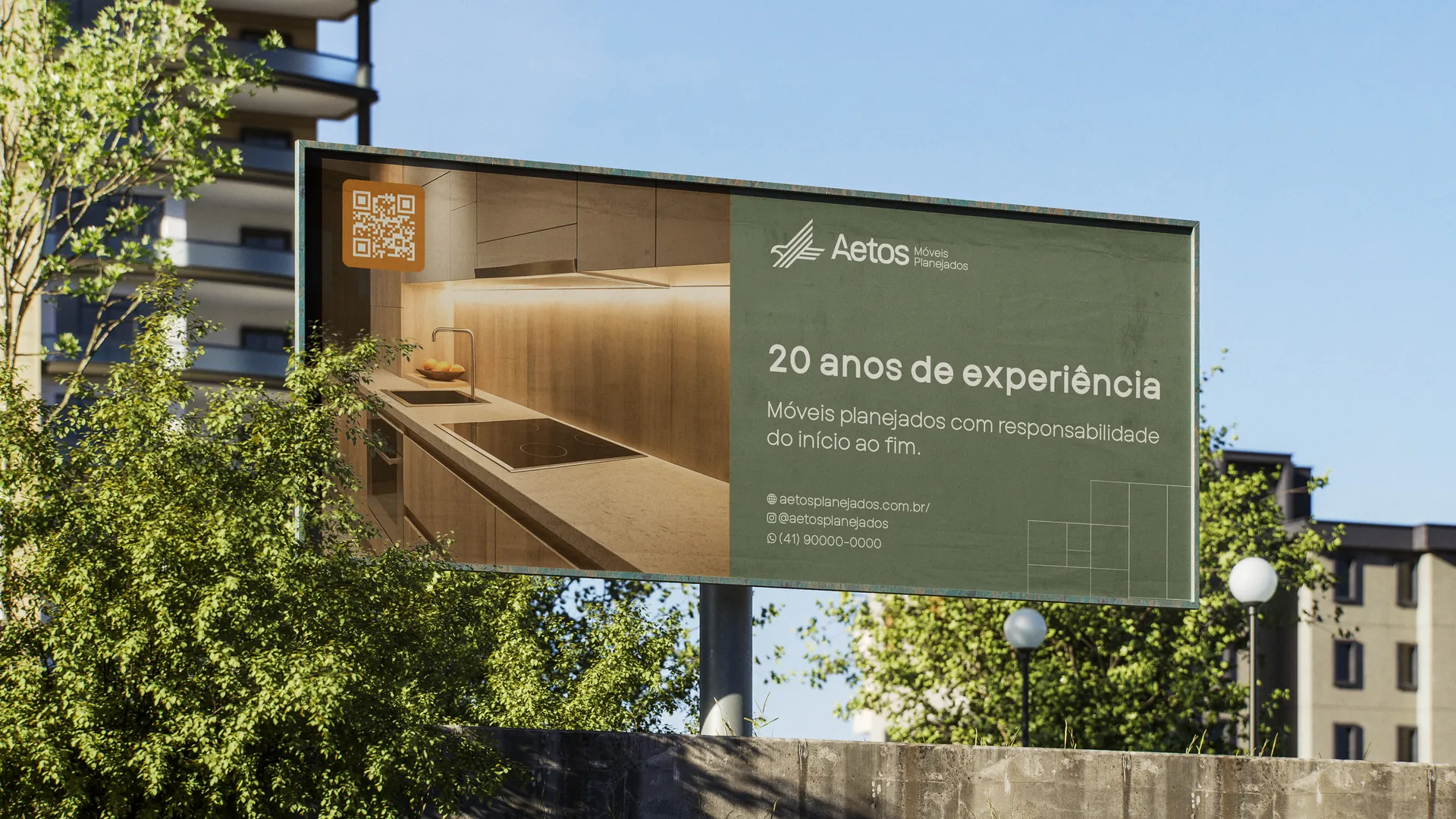
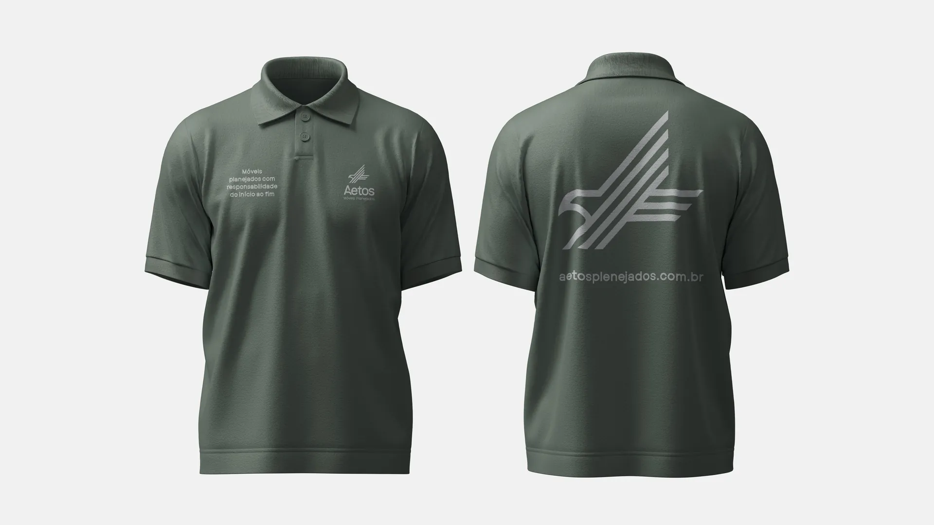
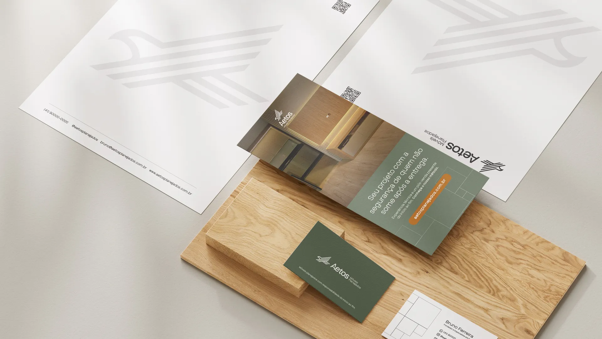
The brand in use.
9 applications
What if your brand had a creative arm like this one?
If you've made it this far, we might be a good fit.