Christian Assembly Peabody
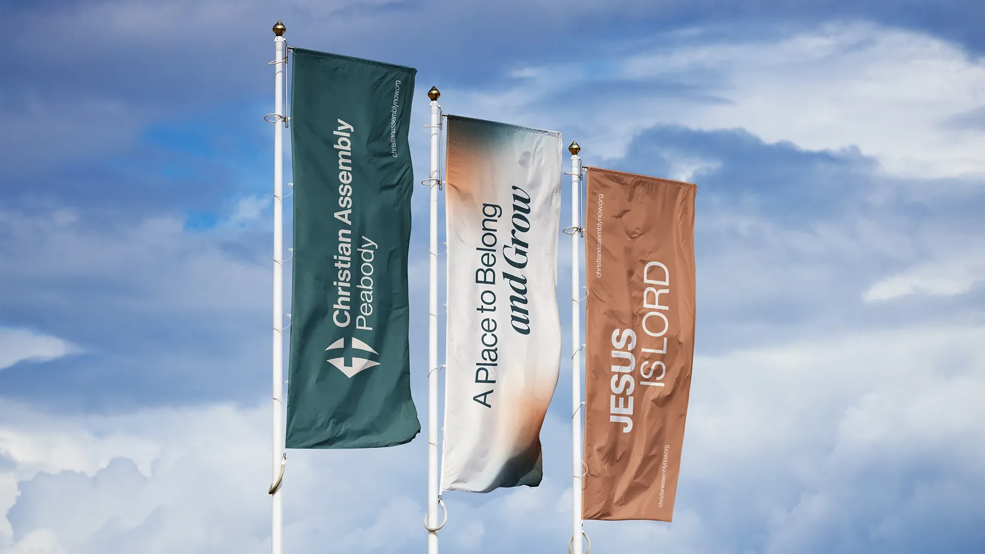
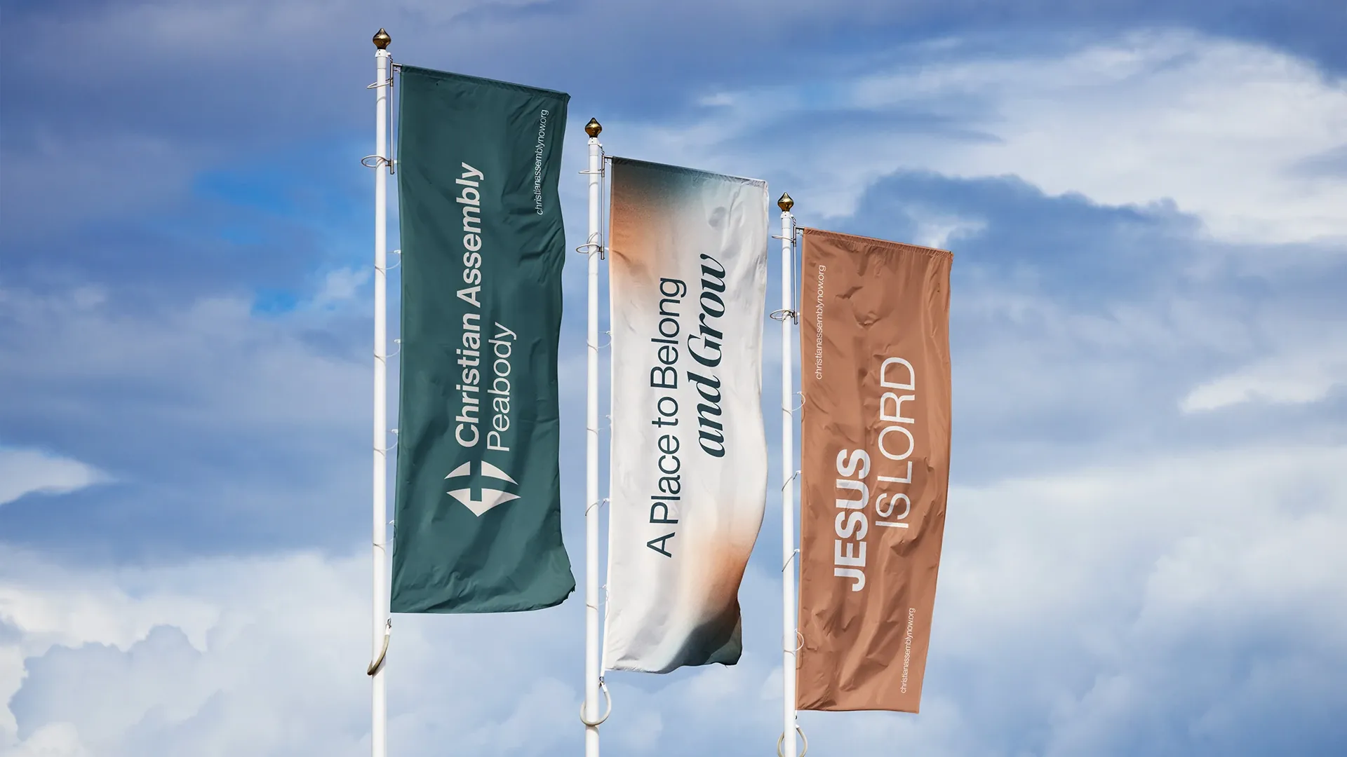
A Place to Belong and Grow.
About the brand
Christian Assembly Peabody is a century-old church in the heart of Peabody, Massachusetts, that grew from its Italian immigrant roots into a diverse, multicultural congregation. It stands at the crossroads of history and future, committed to faithful biblical preaching, Spirit-led worship and compassionate service through initiatives such as its music school and its work with people experiencing homelessness.
The brand serves three audiences under one roof: young families, couples with grown children and the youth, building bridges between generations and cultures without letting go of the timeless truth of the gospel.
The creative process
The challenge was to honor decades of history while signaling a new season of maturity, organization and renewed vision, without losing the warmth that defines the congregation. We built the brand's personality on three archetypes: the Caregiver (who creates safe spaces to welcome and heal), the Sage (steady, biblical, educational) and the Magician (who makes room for the supernatural and for transformation).
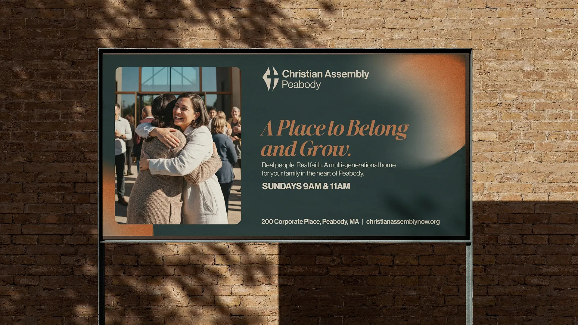
This shaped a tone of voice that is clear, warm, inviting and quietly confident, speaking to every neighbor in Peabody, not only those already inside. The tagline, “A Place to Belong and Grow”, captures the two movements at the heart of the brand: welcome and transformation.
“A Place to Belong and Grow.”
The logo and the visual system
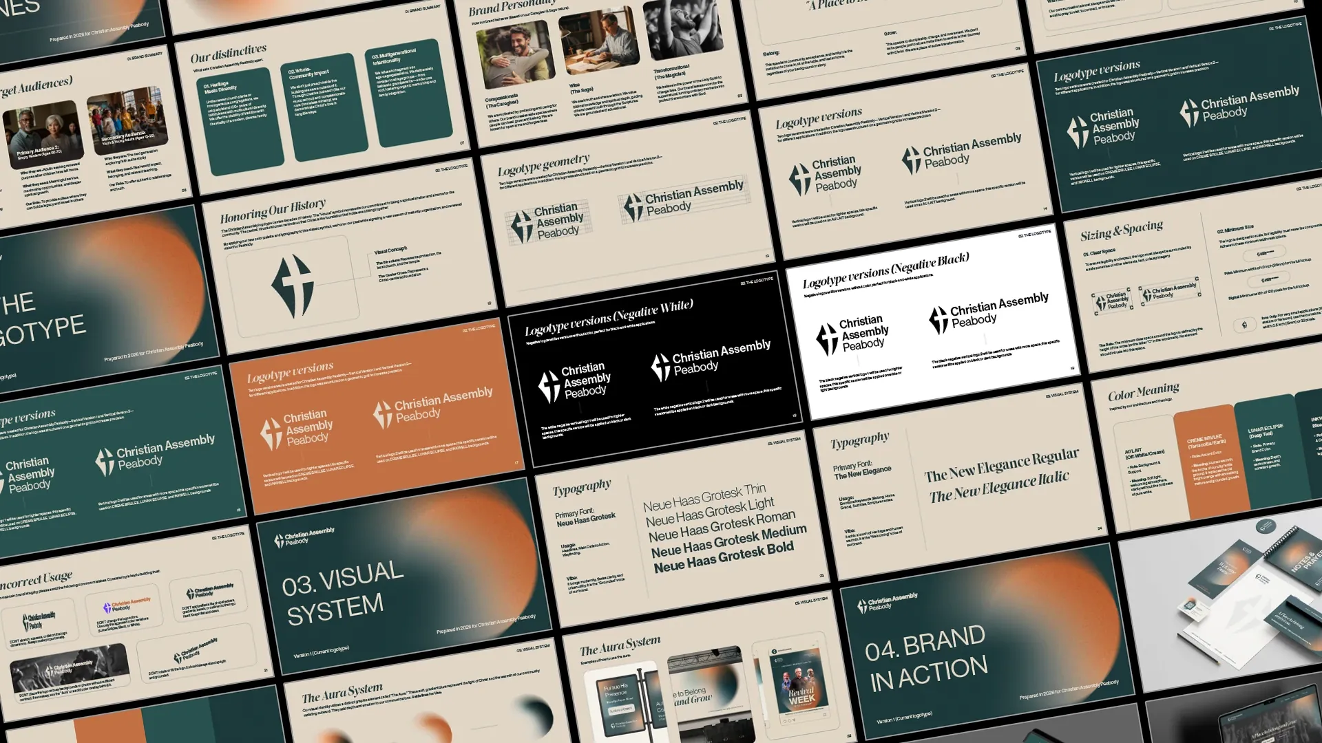
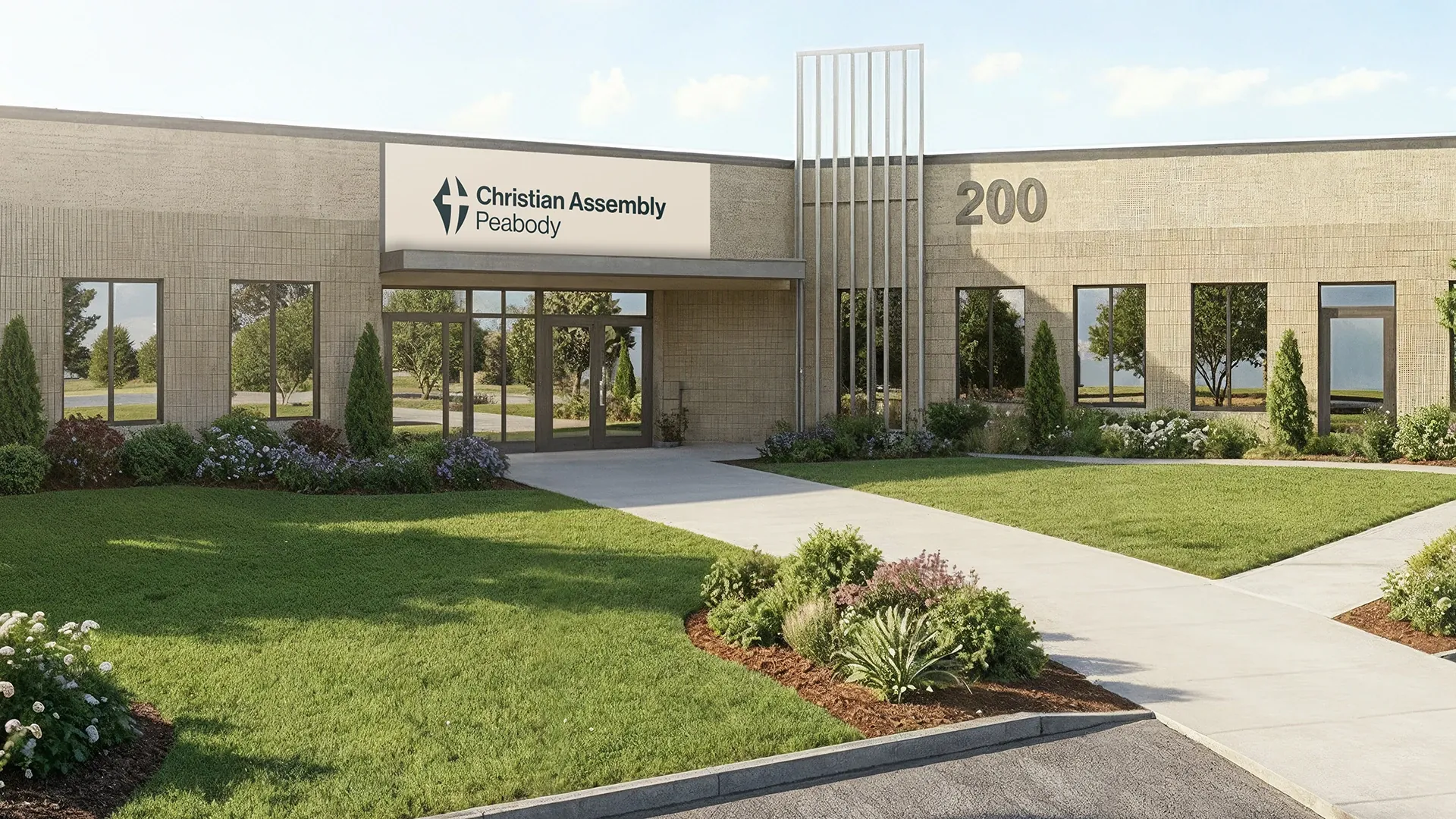
Rather than starting from scratch, we refined the church's historic logo, preserving the equity built over decades. The “House” symbol represents the church as a spiritual shelter and a home for the community, while the central, structural cross signals a Christ-centered foundation. The logo was rebuilt on a geometric grid for precision, with vertical versions and fully reversed versions for greater flexibility.
The visual system
Every element reinforces the balance between technical precision and contemporary energy.
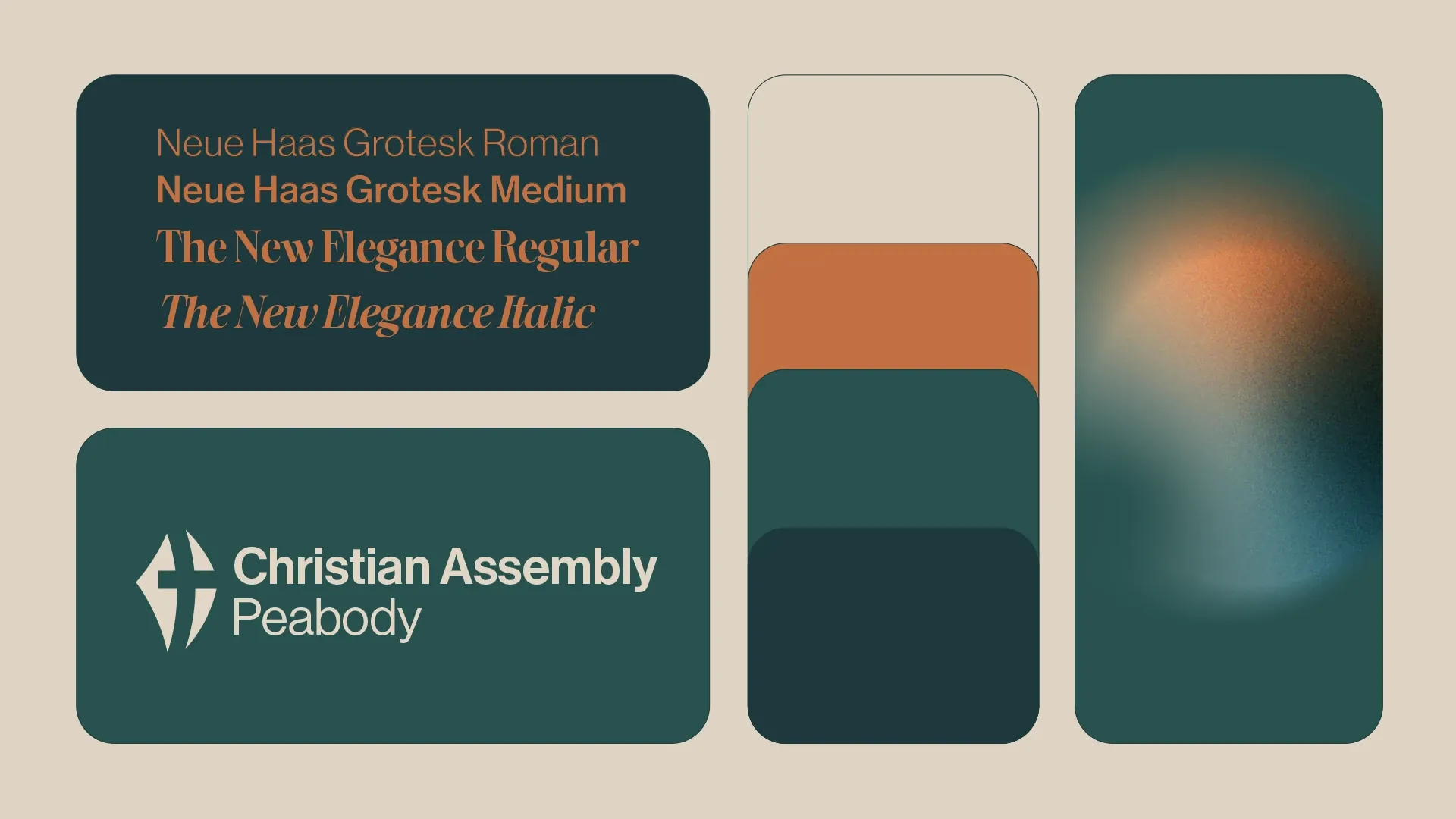
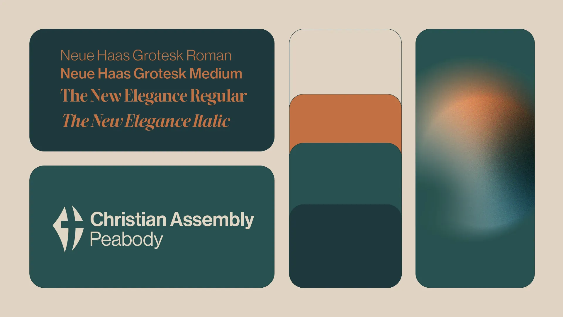
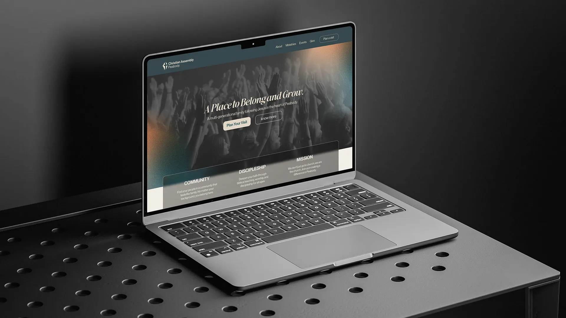
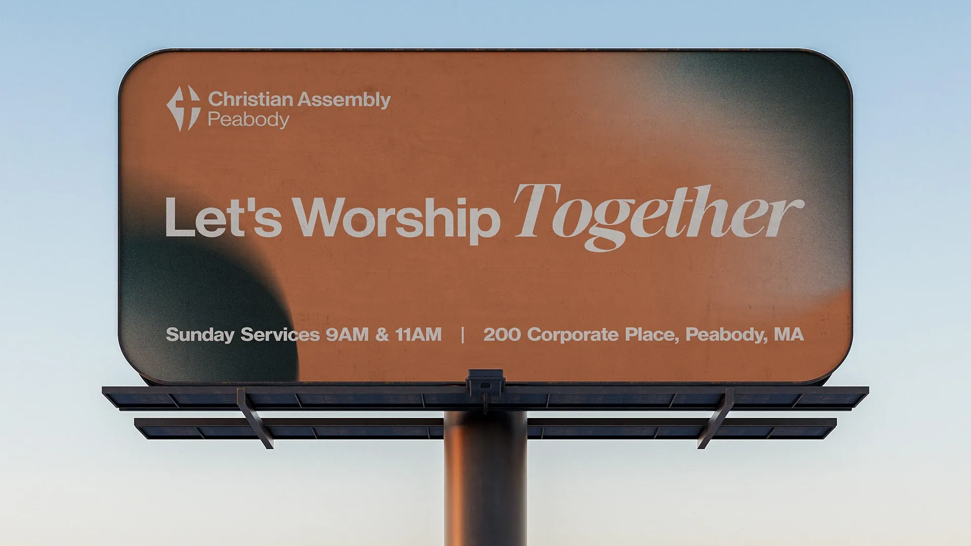
It pairs Neue Haas Grotesk, modern, Swiss and clear, for headlines and signage, with The New Elegance, a softer serif for emotionally weighted words and Scripture passages, balancing the brand's “firm” and “welcoming” voices.
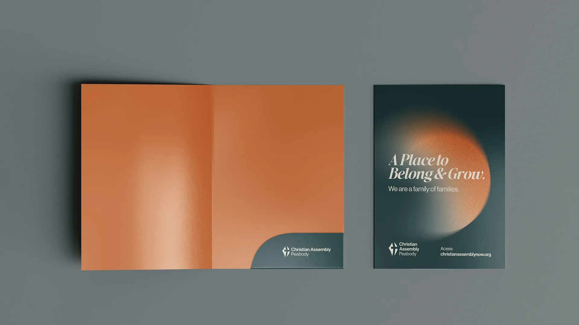
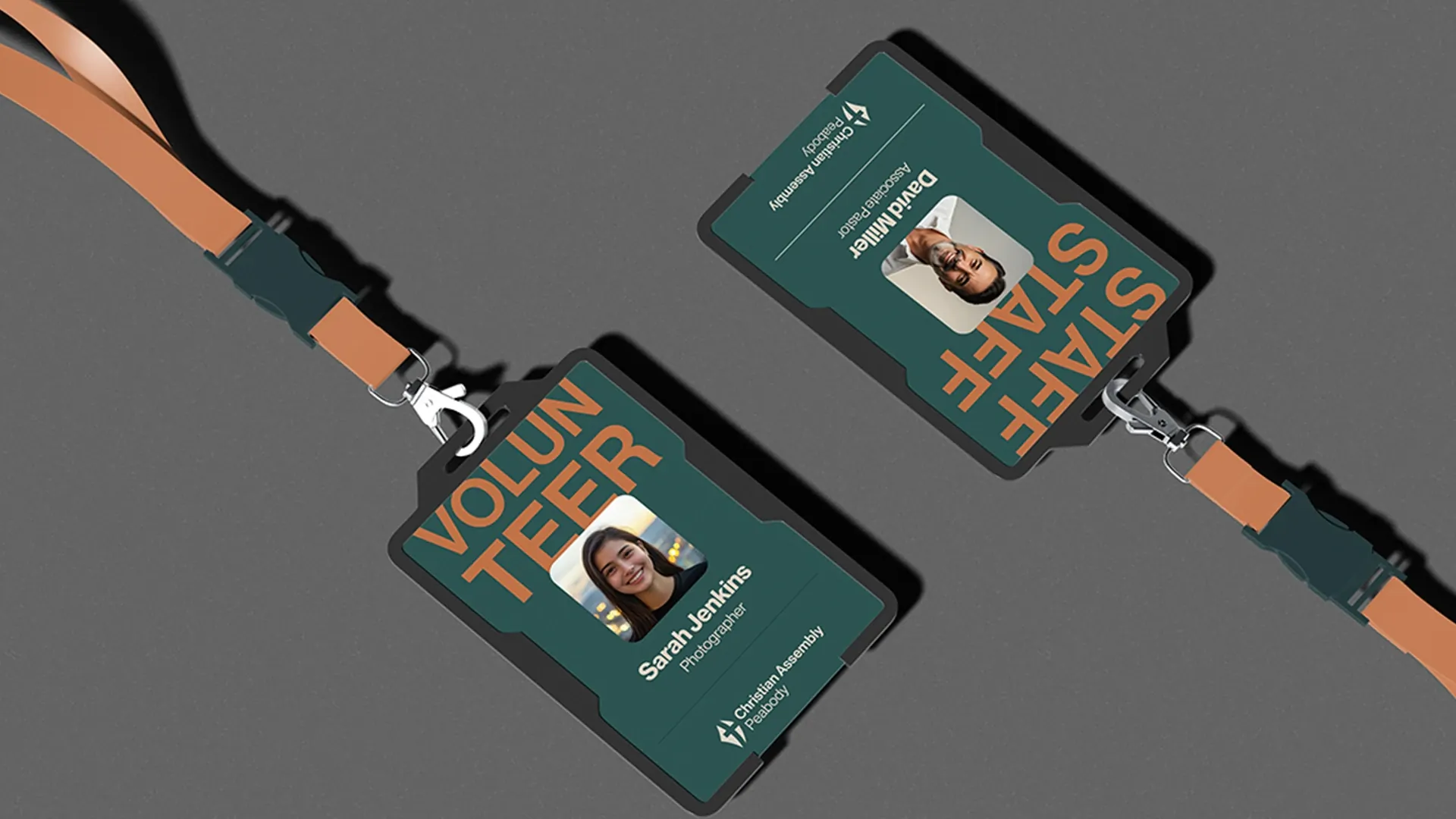
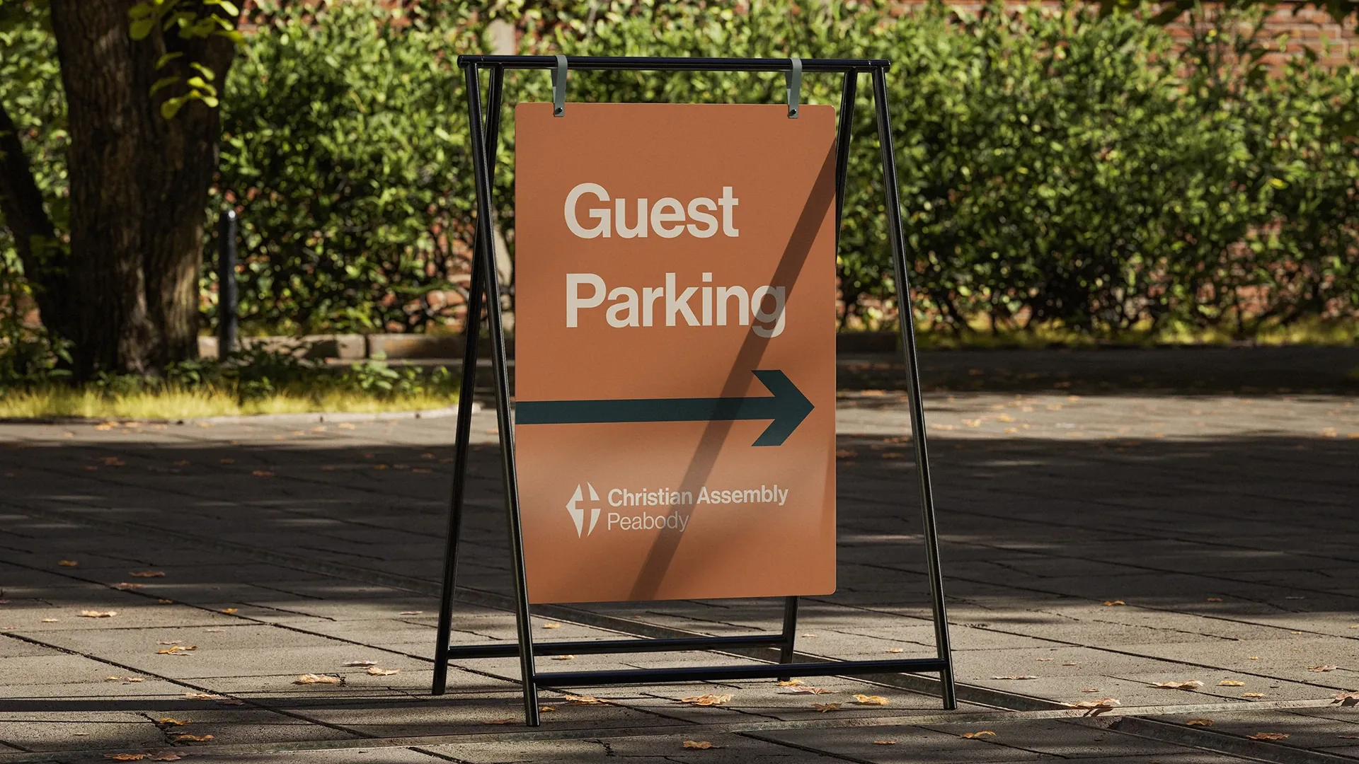
Inspired by the church's architecture and theology. Lunar Eclipse (a deep teal) leads as the main color; Inkwell (an almost-black blue) brings authority and legibility; Creme Brulee (terracotta) adds human warmth, echoing the city's brick; and Au Lait (off-white) offers a soft, welcoming background.
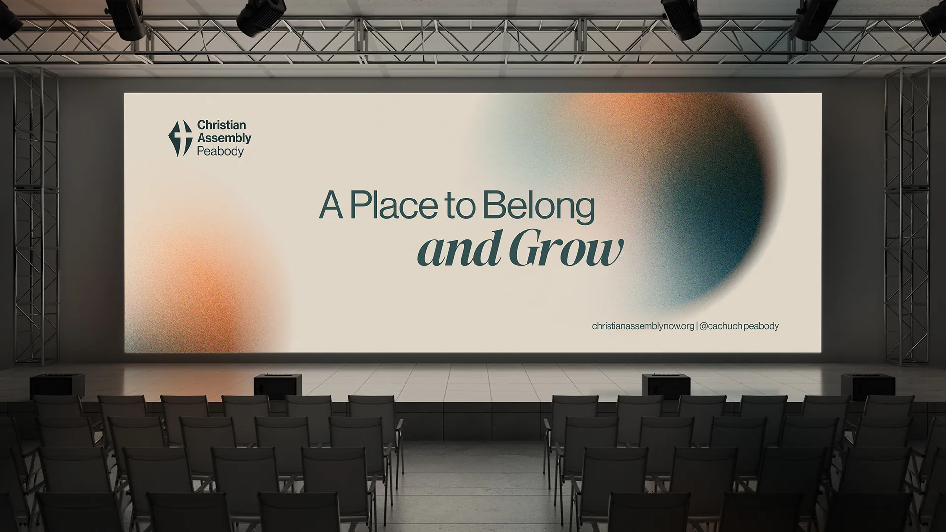
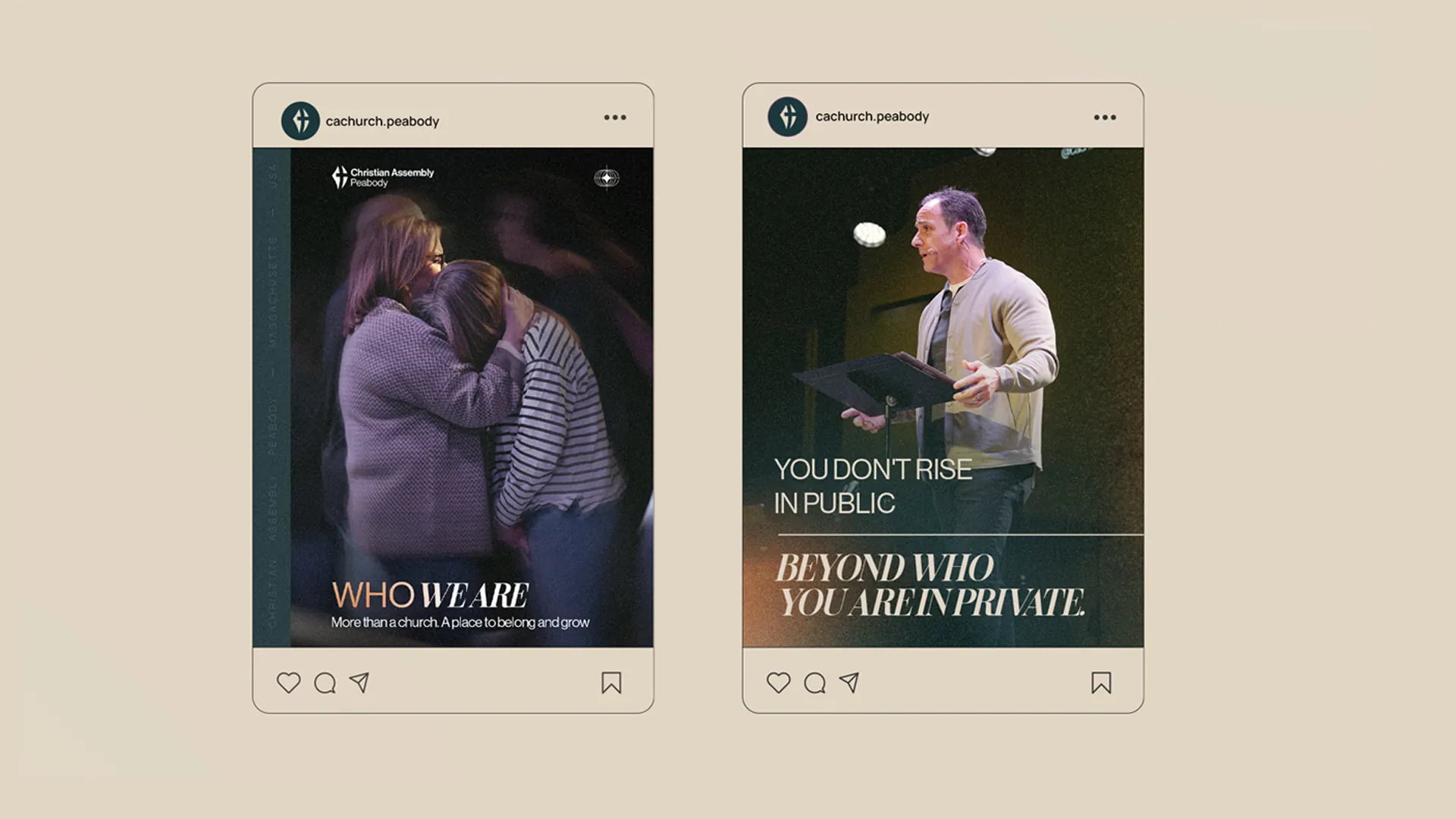
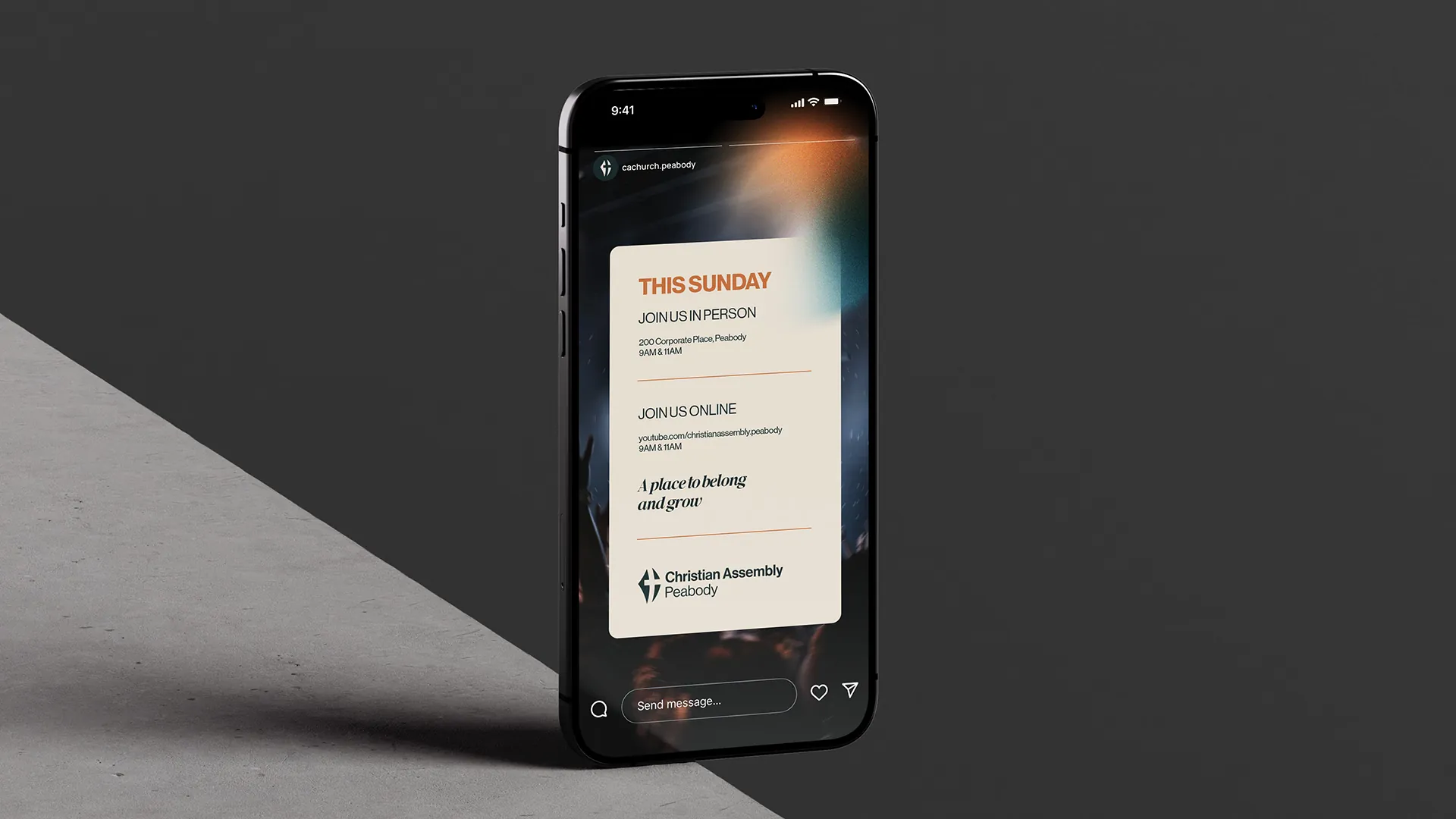
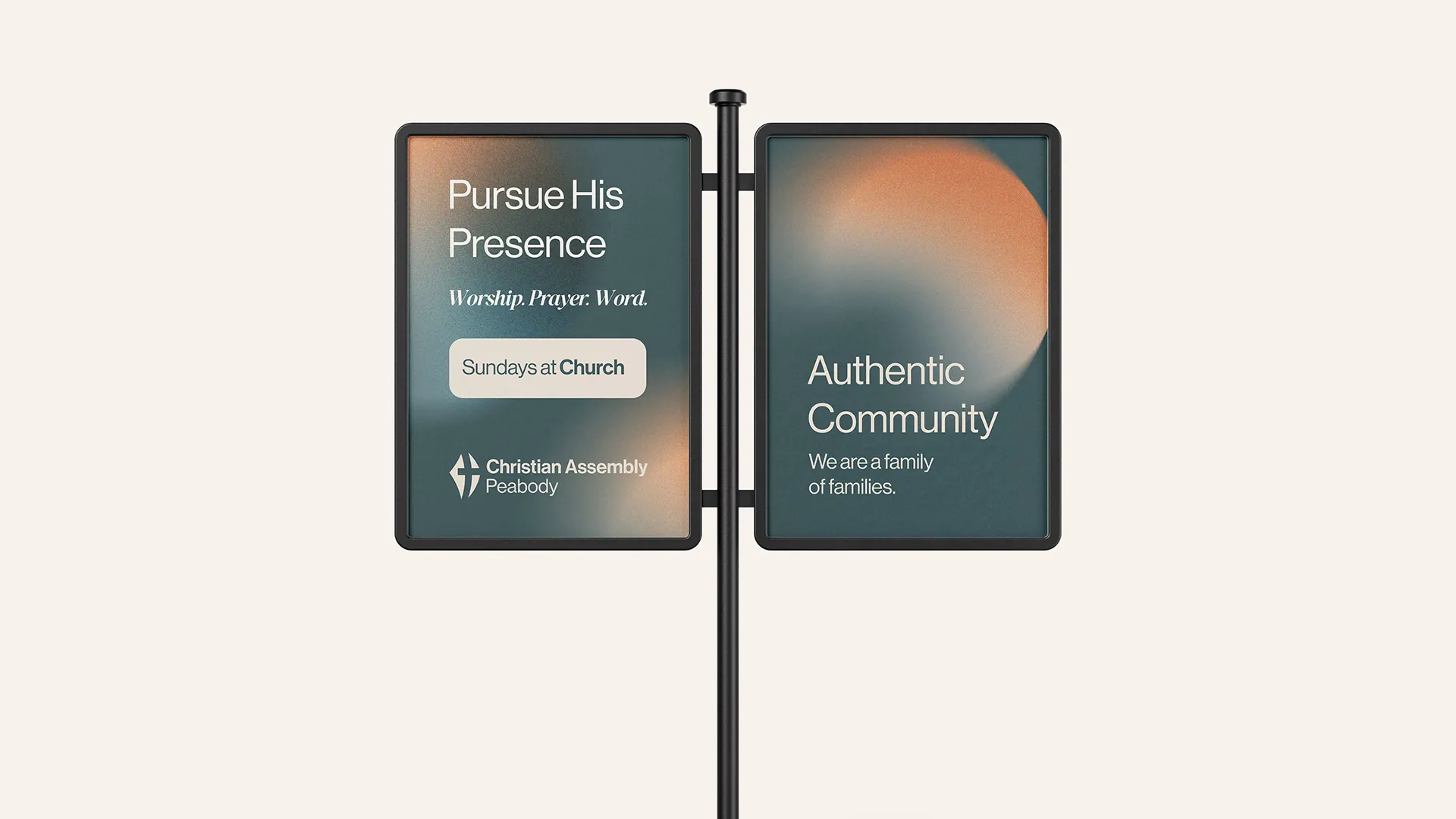
Soft, heavily blurred gradients built from the main palette represent the light of Christ and the warmth of the community radiating outward. It's applied to worship slides, social media backgrounds and covers.
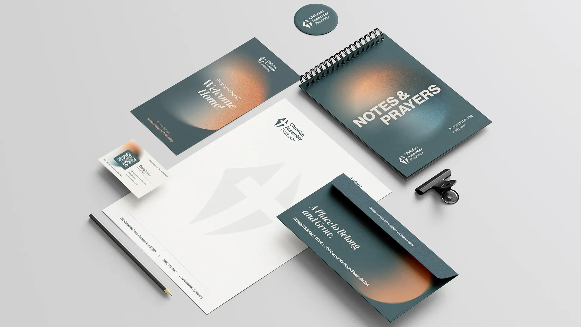
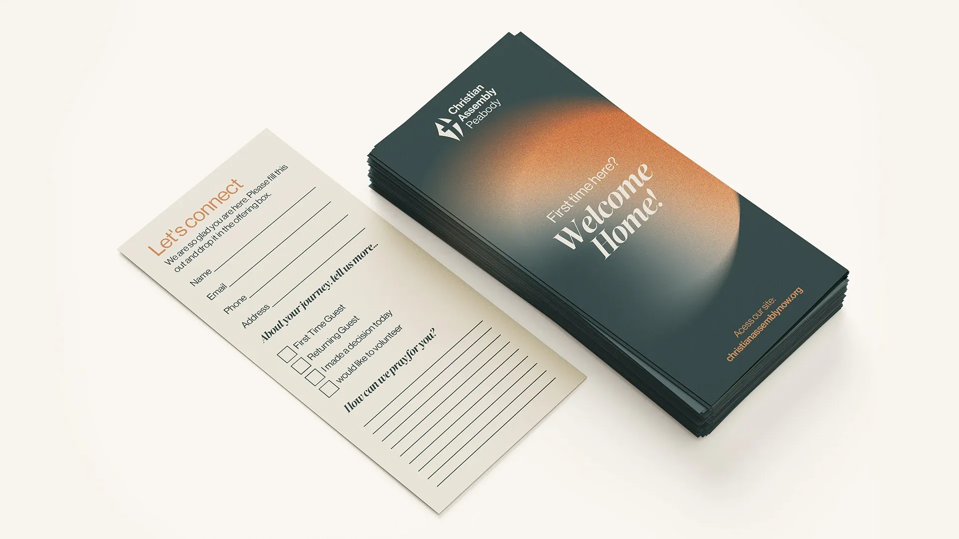
The brand in use.
13 applications
What if your brand had a creative arm like this one?
If you've made it this far, we might be a good fit.